


The logo is the name of the store, made up of a block of aesthetic font, reflecting the premium and beauty of both the store itself and its products and partners

In addition to using the logo in its main form, the customer asked to develop a decorative corporate block with a vector illustration of a beautiful girl on a boat. The store sells Italian jewelry, so the gondola was asking for itself, in addition, it perfectly fit into the composition described by the customer. The biggest difficulty was to develop a suitable figure of a girl. It took a huge amount of time and attempts to develop a sketch suitable for the customer, I developed many elements too smoothly, which the customer did not like, the customer wanted to see the lightness and inconstancy of the wind in the girl. The next point was to add the slogan "Una donna decora il mondo…" to the overall picture, which translates as "A woman adorns the world". The slogan is beautiful, I thought that it should be different from the logo, for contrast, and also that it should be made in a handwritten aesthetic font, as in a letter or a book manuscript. The selection of a suitable font in my opinion took time, but it was worth it. The customer was very pleased with the final result.

The font solution did not require strong problems, the customer asked not to complicate the style much, so a simple, but at the same time pleasant and readable font was added to the font used for the logo.
A few words about the selection of the logo font:
Choosing a suitable font, I thought about the style and aesthetics of the target audience (high and medium-high income, women and their husbands aged 35 to 60 years), in addition, the jewelry is quite large, I wanted to attract people who like this style, who likes massiveness, while he is refined and has aesthetic taste. Going through the massive fonts, I saw this one, it was exactly what I imagined, a massive font, while its subtle features and shifts give the same fragility and aesthetics with it. The customer, after seeing a couple of sketches of the logo, agreed with me, then it only remained to make a beautiful logo out of it.

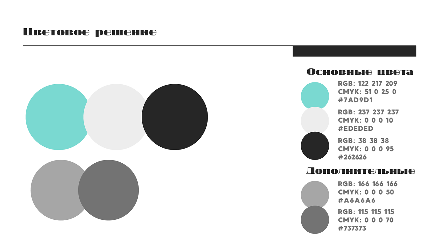
There were also no problems with the color, the general features of the style were already in the customer's thoughts, she had already purchased boxes in the color tone that she wanted to see in the company's style. My task remains to choose the right shade. During its creation, I relied on numerous values and feelings of the company: Tenderness, lightness, aesthetics, femininity, calmness. It was based on such characteristics that I selected the shade, but besides that, I had to think about its readability on different surfaces, on different shades of gray. At that moment, I realized that only dark and light gray would be ideal for this simple and light corporate style, it is these shades that will look natural and soft with any color, without overloading or interrupting the main color.
Prototype of the site in Figma. During its creation, I faced a huge number of tasks and difficulties that stood in the way of how I wanted to see this site, but still, having studied all the possibilities I needed, I was able to create almost what I intended.


